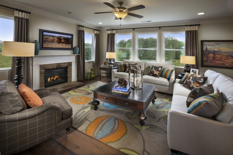
The way the furniture is positioned in a room can have a big impact on how prospective buyers perceive the space. Apartment Guide recently highlighted some of the most common layout mistakes that designers see in a space. Here are four mistakes to avoid.
Placing furniture against the walls. “Not all furniture pieces need to go against a wall,” says Tammy Price, an interior designer and owner of Fragments Identity in Los Angeles. “Actually, you can create a very cozy space by building it out into the center of the room.” Designers recommend moving anchor pieces, such as sofas and chairs, away from the walls.
The rug is too small. “Make sure at least the two front feet (if not all four) of your pieces of furniture are on the area rug,” says Liz Toombs, owner of PDR Interiors. Too small a rug can ruin the rest of the layout of the room.
The dining room table is too big. Remove a table leaf if you can to get the proportions of the table to work better in a space, or “if you have a dining or eating table that is scaled too large for a space and gives you little room or not enough space for dining chairs, consider using benches for seating,” Price recommends. The bench can slide underneath the table so it doesn’t take up too much floor space.
Covering up the windows. Try to find a way to position pieces so they don’t cover up the windows. The more natural light that can flow into the space, the more open it’ll feel, designers say. “Look at sofas with low arms or no arms at all,” Toombs told Apartment Therapy. “It will help to make your room look bigger.”
Source: “7 of the Most Annoying—but Common—Layout Mistakes, Solved,” Apartment Therapy


