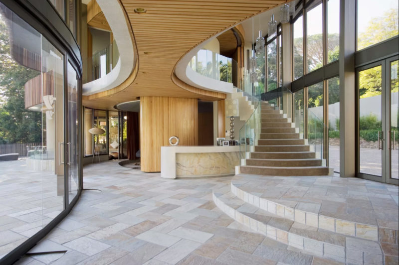
Our modern hallway ideas will help you create a slick, stylish entrance to your home. Plus, we also share great tips from design experts
These modern hallway ideas look at how to create a space for your home that is elegant yet practical.
Getting your hallway lighting right is a good starting point, according to award-winning architect Paul Weston. And there are several tricks you can try to eliminate shadows and illuminate every inch of your space to make it appear larger and more welcoming.
That said, interior designer Paula Gundry points out that it's also about making your hallway ideas personal to you. And if you are someone who puts a lot of importance on privacy, making your hallway a huge open well-lit space may not suit your styling. Meanwhile for others, impact when you first walk in the door is crucial.
We asked architects, interior designers and other experts for their modern hallway ideas ideas to make the most of the area in your home. Here's what they told us.
1. Width is key with a modern hallway
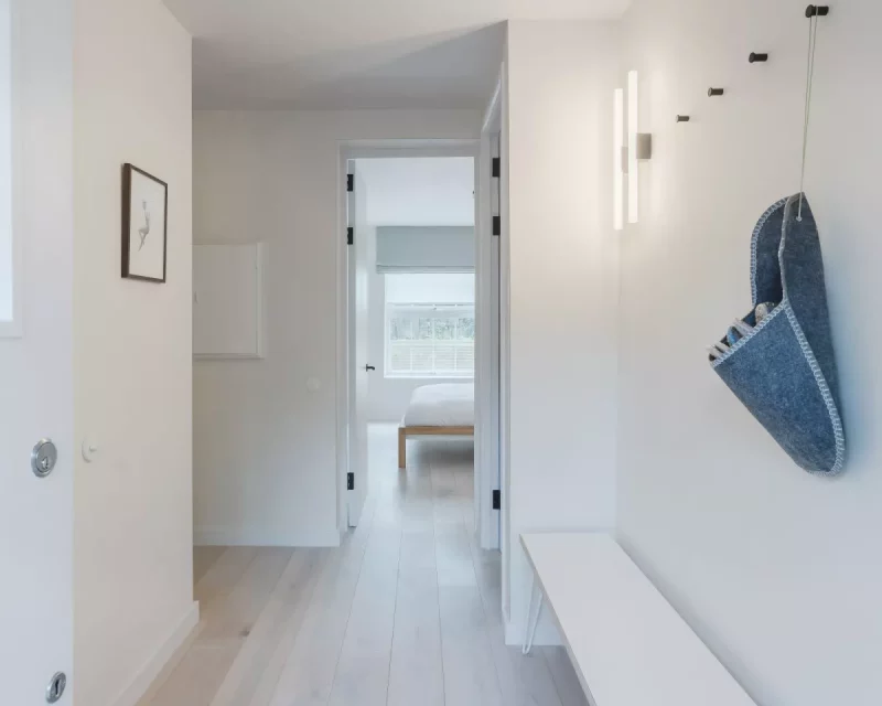
Concentrate on the usable width of the modern hallway area, especially if you are tight on space.
"Maintaining the width of your hallway as you enter allows you to enter and pause while you transition from outside to in," explains architect Pereen d'avoine from Russian For Fish(opens in new tab) in London.
"If the width is restricted by an abundance of coats hung at high level, you feel the need to pass through the hallway quickly and the transition space is lost."
When Pereen designed Newbery House in Islington, as pictured above, she added an alcove for coats so they wouldn't jut out into this key usable area.
2. Hidden windows can lead the eye
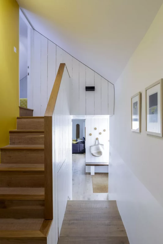
You don't have to see a window, to actually see a window. Instead, tease the eye by simply letting daylight seep into the space. This can draw a guest into the home.
It's a top tip from television architect Charlie Luxton. "One of my favourite tricks is to place a window clearly visible through the idling from when you walk in the front door. This draws your eye though the space and into the house," he told us.
The above example of a modern hallway by his company Charlie Luxton Design(opens in new tab), in North Oxfordshire, demonstrates just how effective this can be.
3. Use mirrors to create the illusion of space
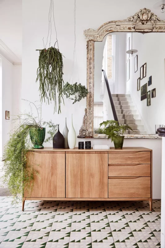
A large hallway mirror can become a stunning focal point but it can also add depth to a modern hallway. If you position a mirror well, it can have similar impact to a piece of artwork too.
Placed on a wall beside or opposite a window, a mirror will bounce the daylight around the space and make it appear larger and more welcoming. A neutral tone on the walls will help this too.
In this hallway, a vintage-style mirror, mid-century modern sideboard and contemporary flooring and accessories creates an eclectic look.
4. Add texture to a hallway with modern wallpaper
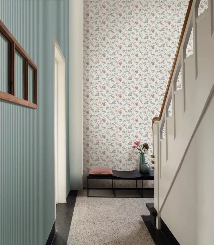
Hallway wallpaper can add intrigue to a space and set it apart from other homes, especially if you have a spectacular custom design. And if you're more reserved in your styling, wallpaper isn't just about colour either; it's about texture.
Knowing how to wallpaper is a good place to start as well as choosing a design that suits your personality.
"Adding a feature wall with wallpaper is a great way to add texture to any space," Gawaine Archibald, from Archibald's Decorating & Renovating(opens in new tab) explains.
When the Eastbourne-based decorator worked on Mark Wright and Michelle Keegan's new home in Essex, he used 120 rolls of Villa Nova wallpaper, which had light tones and a textured finish.
"We emulsioned all the ceilings in Tikkurila white emulsion, painted all woodwork in Johnstone's aqua satin in brilliant white, then hung wallpaper to all the walls. The finished look was stunning."
5. Consider going double height in a modern hallway
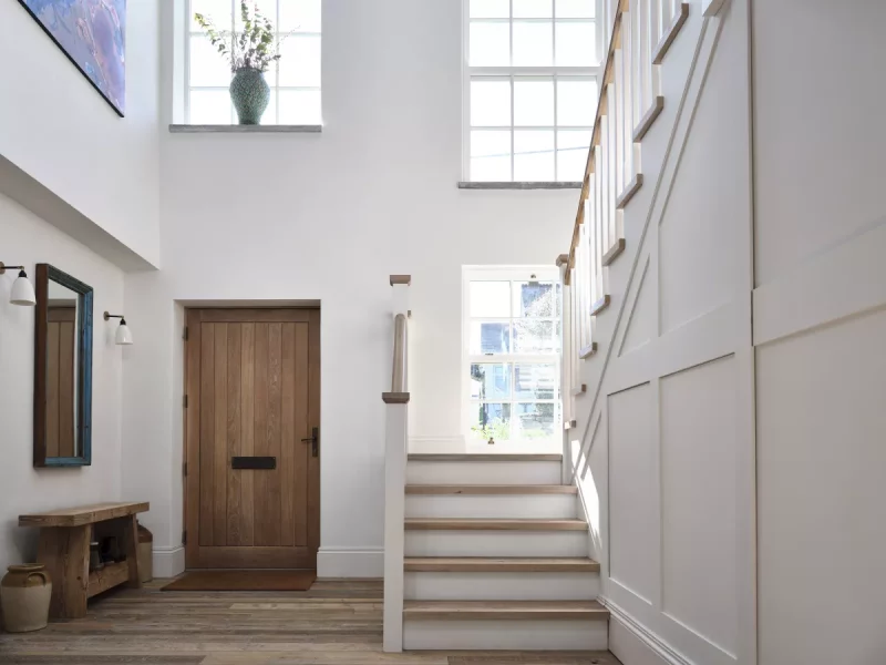
If you are still in the planning stages of your build and you have the luxury of space, making your entrance hallway a double-height room is a real showstopper.
It gives anyone entering your home the impression of a large, open build that draws your eye upward.
It's a neat design trick we often see on homebuilding TV shows like Building the Dream. And for good reason, because it really adds something special to a home.
It doesn't just work in entrance hallways either. A double-height area in an upstairs hall or downstairs passageway adds drama too.
We usually imagine these double-height spaces to have skylights but you can also use a higher-level window to flood the area with daylight as well as using a suspended pendant light or contemporary chandelier to give a wow-factor to the space. Window seating can provide some much-needed but discrete storage too (as below).
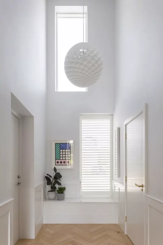
6. Introduce a well-considered lighting scheme
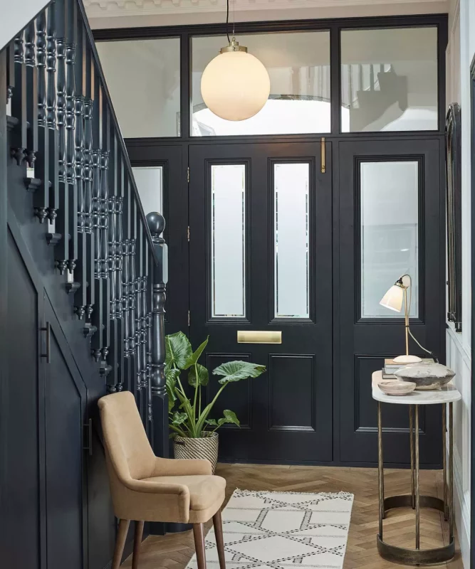
Focus is often put on adding daylight to a space but it's also important to consider lighting during the evening too.
"When planning your decoration project on your entrance hallways and hallways linking to other rooms you should always think about daylight and evening light," celebrity decorator Gawaine Archibald says.
Also, try to make a guest look up. "Ceiling height and wall lights are great for this or tall lamps on a console table work well too."
If you aren't sure what kind of lighting might work in your space, it's worth looking at some hallway lighting ideas.
7. Don't be afraid to make a modern hallway cosy
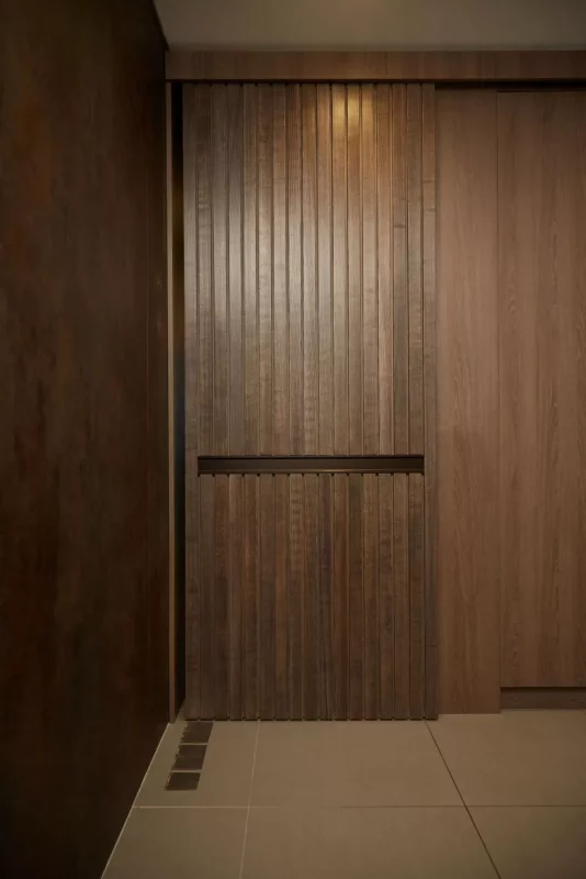
Having said it's all about light, having a large open well-illuminated space doesn't work for everyone.
Paula Gundry(opens in new tab), an interior designer based in Norwich, explains how one of her clients needed the opposite in his modern home.
The house he had bought was a five-year-old build in the city and the existing set up in the hallway meant pedestrians could see straight into his sitting room from the road. It wasn't very private.
The space was also so large the client felt lost in it. It didn't suit his more functional, masculine and edgy style.
"The entrance is the first opportunity to set the scene on what the home is like," she says. "It gives a flavour of what people can expect. While some might want it to be more imposing and impressive, that's not always for everyone."
Paula reduced the hallway area in this particular home, adding a suspended ceiling and portioned some of it off to use as a utility room as well as a comms room. Doing so meant the space became more cosy and personal to her client.
She also introduced full ceiling-height end-to-end internal storage cabinetry to remove clutter from show, with discrete sliding doors to add privacy to other rooms.
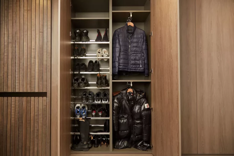
8. Use contemporary sliding doors and veneers
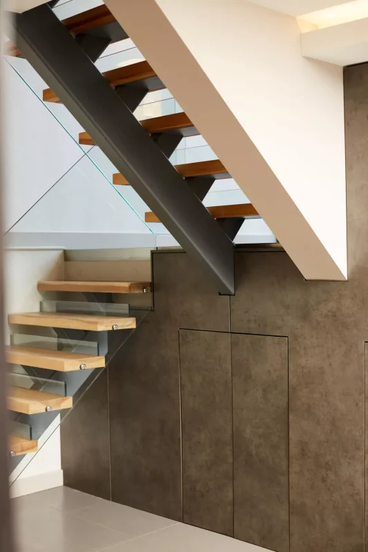
If you are going for a more contemporary hallway style, it's about giving the area a more pared-back look.
Sliding doors are perfect for this. Rather than pulling out into an area, a sliding door gives a streamlined feel, Paula Gundry explains. The technical aspect of a sliding door moving smoothly into place with its moving parts is all part of that.
Using veneers gives a contemporary feel too. There's no warping with a veneer so everything is precise and gives a flawless finish.
Not only were veneers used for the internal cabinetry but when renovating the stairwell, they were added to the treads too.
Darker colours on the walls created a look that contrasted with the ceramic flooring, with the floor tiles being the only element of the previous design of the house that was not altered due to underfloor heating.
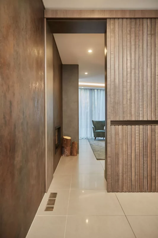
The Norwich-based interior designer never decorates one space in isolation either. For each of her projects, she likes to fit out the whole home as one, so the paintwork, murals and woodwork finishes work together in a cohesive way.
"Look at function first, then the layout. Decide the concept and carry this through the property. It's all about meticulous planning right down to the detail in all of the finishes."
9. Showcase your home's architecture
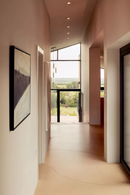
If your build has a stunning architectural feature, like an unusually angled roof or cantilever design, show it off inside the house too.
A hallway or passageway is the perfect place to do this.
"Corridors and entrance halls are one of the few moments in a home when you look up and really engage with the architecture of the building. It’s a chance to combine function and aesthetics to bring joy," Charlie Luxton explains.
"You need to think of the hallway as a part of the entrance sequence arriving in a building, not as a space in isolation.”
His design above shows a hallway that uses a sloped ceiling to highlight the exterior architecture of the building on the inside too.
10. Exploit a garden view in a modern hallway
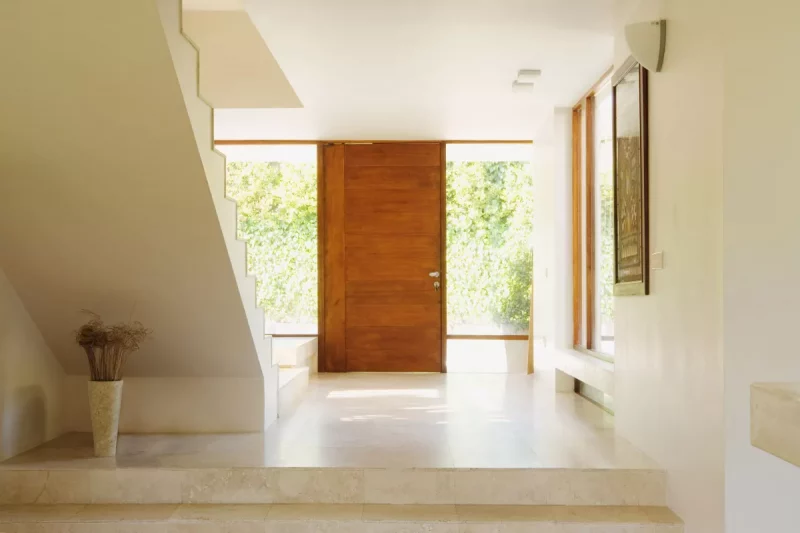
Rather than hang pictures of nature on your walls, you can instead incorporate the views of your garden into your build. Not only does this bring the outside world into your home, but it adds plenty of natural light to your hallway, says Suffolk-based architect Paul Weston(opens in new tab).
A stone floor – and even staircase – meanwhile adds continuity to this home. A contemporary wood door between your floor-to-ceiling windows is functional but also frames the look.
11. Dabble with bright colours for a bold, modern finish
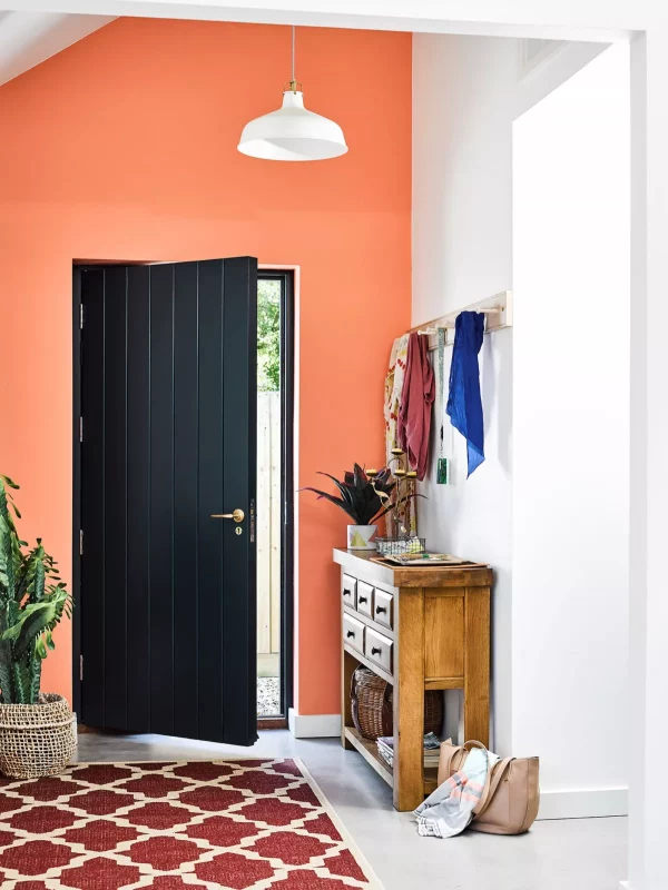
Choosing the best hallway paint is about playing with colours that work with the rest of your home. Using colour in vinyl matt finishes on ceilings and walls can be effective and make a wall in a room "pop".
"It's about bringing in the ceiling and walls in the same colours or being bold and painting the ceiling in a darker colour if you have high ceilings and original period features," explains decorator Gawaine Archibald.
12. Practicalities can be fun in a modern hallway
Image 1 of 3
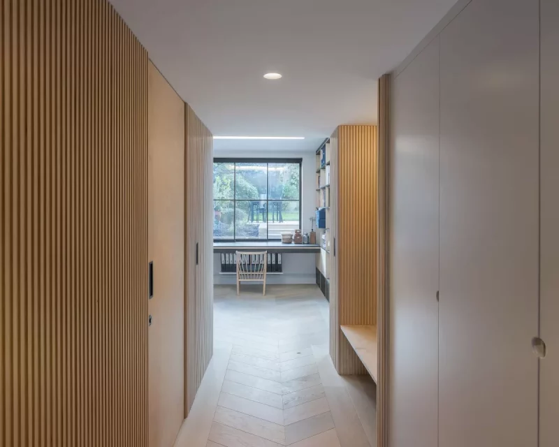
Hidden behind the cladding on the wall of the hallway is a discrete downstairs bathroom(Image credit: Peter Landers/ Russian For Fish)
This fire door is recessed into the wall to create a seamless look in the modern hallway(Image credit: Peter Landers / Russian For Fish)
A build or renovation might need to include safety features like fire doors. These don't have to be ugly and simply practical in a hallway, instead you can have fun and make them a slick part of the design.
"Often the doors off a hallway are fire rated and form part of the fire strategy of a house in an emergency," explains architect Pereen d'avoine, from Russian For Fish.
"These doors are not required to be closed on a day-to-day basis and folding a door back into a purpose made alcove will allow the hallway to feel unobstructed."
Pereen designed the fire door in this modern hallway to be pocket doors to fit in a recess as part of the hall wall, serving its purpose as a fire door only in an emergency.
13. Create a through-view into the back garden
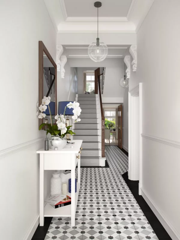
Another modern hallway idea to consider, is opening up doorways or using glass doors to see through the house and into the back garden — creating a through-view.
It's an idea TV architect Charlie Luxton often uses, again to invite and lead the eye into the rest of the home.
It also brings nature into our homes by showcasing what's going on outside as well as adding daylight.
14. Use exterior materials to link inside to outside
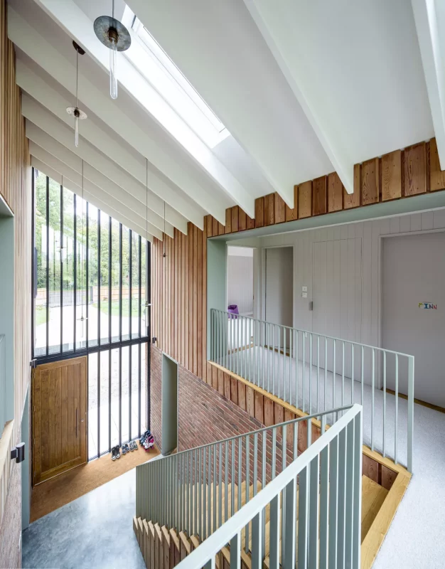
When architect Jake Edgley of Edgley Design designed the hallway in one of his award-winning self builds, he used exterior timber cladding on an internal wall to bring the outside world into the double-height space.
The primary wall was finished in the same western red cedar cladding as the outside, which helps to link inside to outside.
He positioned a skylight above the design to add sunlight and continue the theme of bringing nature inside. A glass balustrade and lightweight contemporary staircase provided transparency to complement the look.
Your home doesn't have to be cedar clad for this inside-outside theme to work. An exposed red brick wall can provide external texture to a hallway too, as can painted render, or bare basalt, sandstone or granite bricks.
15. Add a matwell to your modern hallway space
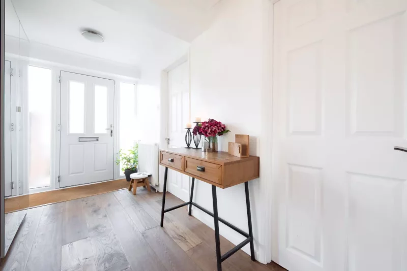
While this idea isn't for everyone, an integrated matwell with a recessed coir doormat is a really practical idea in a modern hallway. It can particularly suit busy family life and making sure small children (and grown adults) don't tread mud through the home.
And it's also a great hallway flooring idea to help prevent gravel or other sharp objects stuck to the bottom of outdoor shoes from scratching hard flooring. "A full width doormat to the depth of the door can really help to protect the internal floor," adds architect Pereen d'avoine.
16. Provide a glimpse into other spaces in a modern hallway
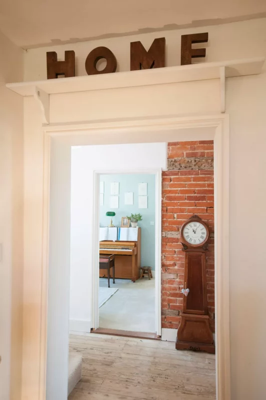
Hallways don't have to be dark, gloomy spaces. If you can't add a skylight or window, use glass doors or ditch doors to other rooms entirely to open up the space.
Giving your hallway sight of other rooms and spaces can lead the eye into your home and make the space feel more inviting and give a "wow" factor.
"A hallway is a space that links other areas together. It can be just functional but with some careful design it can offer so much more," architect Paul Weston says.
17. Be bold with stunning flooring
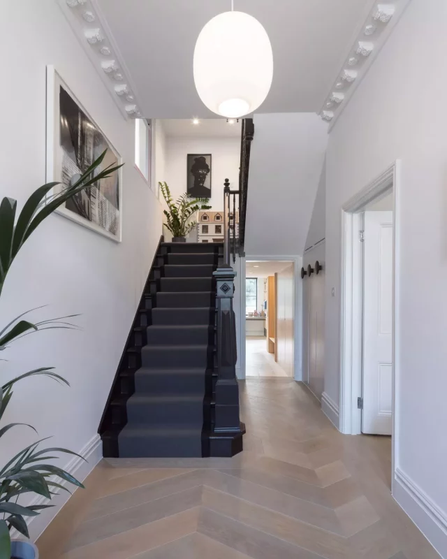
If you are a fan of toned-down white or neutral walls, a striking floor in your modern hallway can be a real feature. If you add continuity with this into other rooms, it can also make a small or narrow hallway feel like larger.
If the area you are working with is restricted, it's worth looking at some small hallway ideas to make the most of your space.
Source: homebuilding.co.uk


