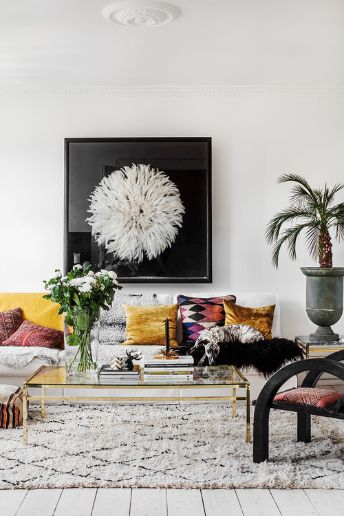
Some design mistakes may be making rooms in a property look smaller or less inviting. These can be deal killers if you’re trying to sell the home. Design experts at Houzz recently weighed in on some of the most common decorating mistakes they see, and how to fix them, including:
Overcrowded shelves
Open shelves that are crowded with mismatching items can be a distraction. Empty the shelves and then organize them using professional organizer Marie Kondo’s motto: “Beautiful, interesting, or out.” Reduce the items and only use the beautiful and meaningful objects to make the shelves feel more open. Try painting the back of the shelving to then enhance the collectibles displayed too. For example, white items against a dark shade can really pop.

Photo by Klopper and Davis Architects - Discover dining room design inspiration
Misplaced furniture
“We want guests to be impressed by our home’s public spaces, but often style takes precedence over comfort and we end up with a dressy room that feels stiff and unwelcoming,” writes designer and Houzz contributor Janet Dunn. Arrange the seating in a living room in a way that encourages social interaction, she notes. Put sofas and armchairs in how people would communicate with one another, and place seating close enough together to foster conversation rather than moving it up against the walls.

Photo by RUHL STUDIO Architects - Browse family room photos
High-hanging artwork
Designers say a common mistake is how high artwork is hung. “Consider the human scale and hang artwork with the center point at eye level in spaces where people stand, and lower where it’s viewed from a seated position,” Dunn notes.

Photo by Mari Strenghielm - Search living room pictures
Too many focal points
Everything shouldn’t be catching your eye when you walk into a room. A “focal point” is a designer’s term that means “a primary place for the eye to rest before taking in the whole space,” Dunn notes. “A room without one lacks life, balance, and harmony.” Focal points may be an architectural feature, artwork, or a fireplace, for example. Plan the room’s decor around that focal point, such as by arranging furniture around the area to direct attention to it.

Photo by Laura Nathan Design - Discover living room design ideas
Source: “Decorating Master Class: 10 Common Mistakes and How to Fix Them,” Houzz (Aug. 19, 2019)


